Farnus visual identity / 01
A system with
room to grow.
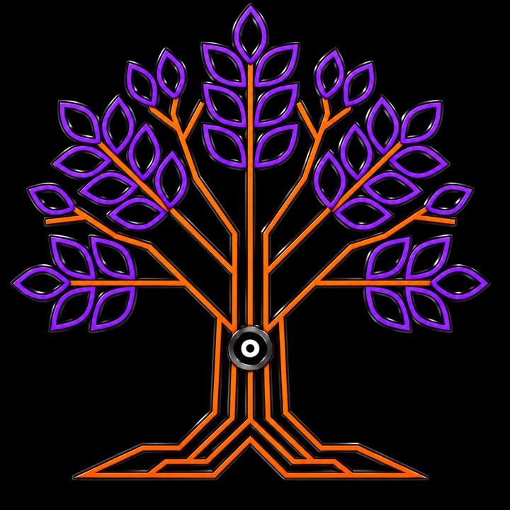
This is the working visual foundation for Farnus Technologies: a living tree mark, electric purple growth, bright orange roots, and a restrained leaf-green accent. The text header is intentionally left open for the approved wording.
Working brand guide · v101 / MarksOne tree.
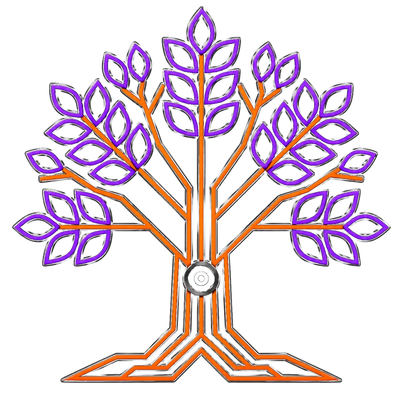
One tree.
Two expressions.
Use the flat mark for compact placements and simple reproduction. Use the dimensional mark as the signature visual when it has room to breathe.
WORDMARK / TEXT HEADERPending approved text headerKeep the company name in a clean typographic lockup until final wording is supplied.
02 / ColorLiquid neon.
Liquid neon.
Rooted in contrast.
Tap a swatch to copy its color value. Purple carries the living system; orange marks energy, action, and roots. Leaf green is a restrained botanical accent. Black creates depth, while glass and white keep the interface legible.
Color values are ready to copy.
03 / TypeClear by nature.
Clear by nature.
Expressive by choice.
Use display type for the idea, sans serif for the explanation, and mono for labels, status, and system detail.
Build your
own way.
Dependable business systems should make it easier for people to understand the work, strengthen their judgment, and build on their own terms.
RECORD → INTERPRET → DECIDE
04 / ElementsGlass, light,
Glass, light,
and restraint.
Let the logo lead. Use luminous edges sparingly, keep glass panels readable, and reserve orange for meaningful points of focus.
Violet highlights movement and possibility.
Orange signals energy and action.
Glass sits above deep, quiet backgrounds.
People remain the center of the system.